Welcome to the new face of baseball in Cleveland.
I love sports.
One of the things I love most about sports is their power to bring people together regardless of age, gender, race, or religion.
This project was developed to solve part of a big problem in sports that is pulling people apart instead of bringing them together. For many years, the Cleveland Indians of the MLB have held on to a name and brand that is openly offensive and disrespectful to First Nations people. The Cleveland Force brand identity was created to replace the current Indians brand and introduce a new age of baseball in Cleveland.
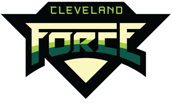
Heritage. Grit. Vibrance. These brand qualities represent what the city of Cleveland is about, and the final logo and encompassing brand identity was carefully designed to visually represent these qualities. The carefully measured angles, shapes, and strokes within the logo represent the history of Cleveland and the manufacturing and fabricating industry that this city was built on. The logo's triangular shape and descending angles give it an attitude that matches the gritty, die-hard nature of Cleveland and it's great people. Finally, the sharp, crisp edges of the logo and the blazing greens represent the exciting vibrancy of the city.
Research was vital in this project to develop a brand direction that satisfied the needs of the city in this new face of Cleveland baseball. Focus groups were used to discover the details of how the current team identity is offensive and how it can be corrected in a new brand. The extensive legwork of this project was essential to develop creative that solved the problem in an effective way for the city of Cleveland.
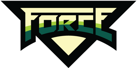
Cleveland has long been known as the "Forest City", a name that the city is proud of. The two green colours of the new team represent this heritage, and also represent the two World Series Championships that the franchise has achieved. The style of the of the logo is also reminiscent of the countless graffiti street art works that are on display around the city.
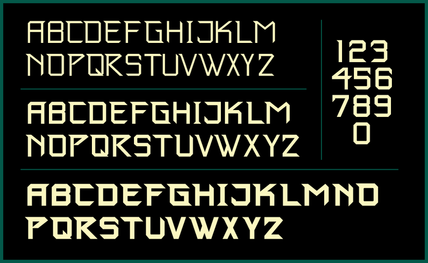
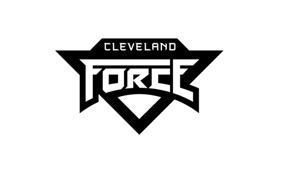
The custom "Cleveland Force" font was built on the same brand qualities so that an impeccably unified and cohesive brand could be applied to all artifacts. The versatile font is available in Light, Medium, and Bold weights.

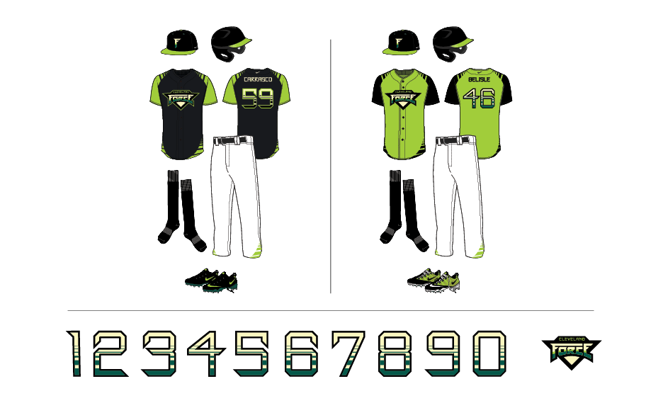
Uniforms were carefully designed to continue the brand qualities into a dominate and exciting visual presence on the field.
The new team identity is clean and elegant, vibrant, and it shows the gritty, never-give-up attitude of Cleveland that the team will carry into each game.
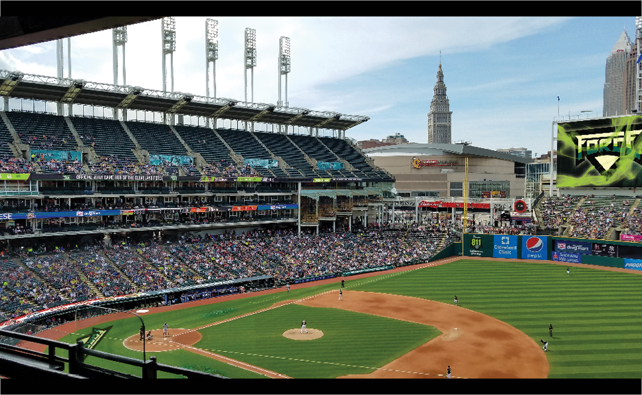
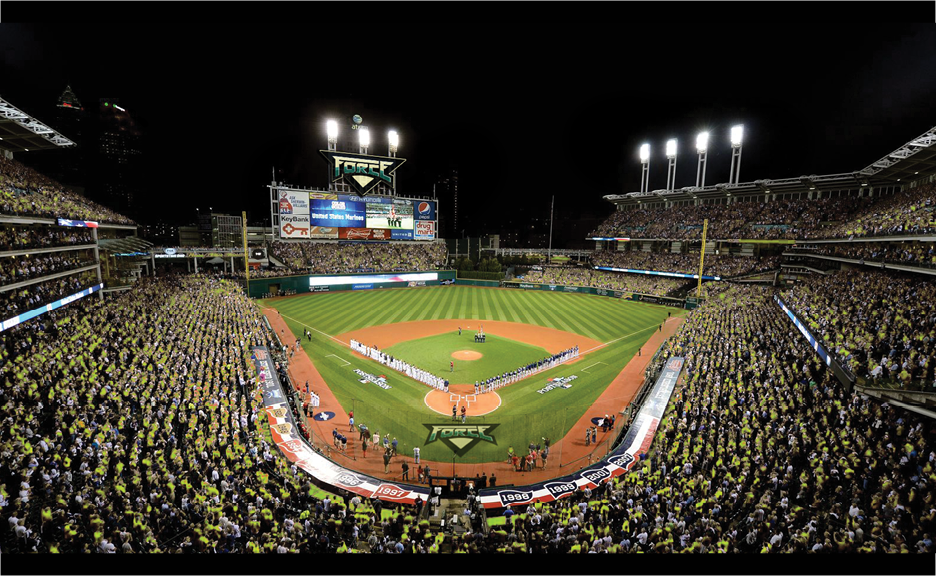
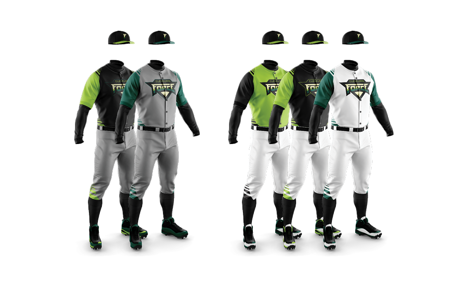
These photos show the versatility of the brand as well as the brand's presence in a ballpark if fans are wearing team apparel. The Force identity is a presence that the entire city can rally behind, one that accurately represents the resilient and hard-working city of Cleveland.
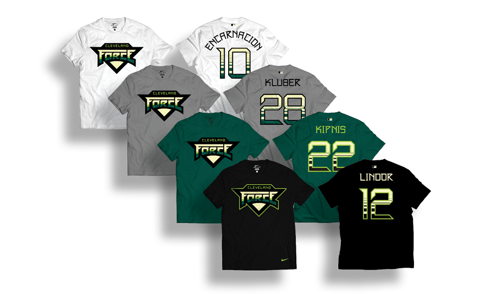
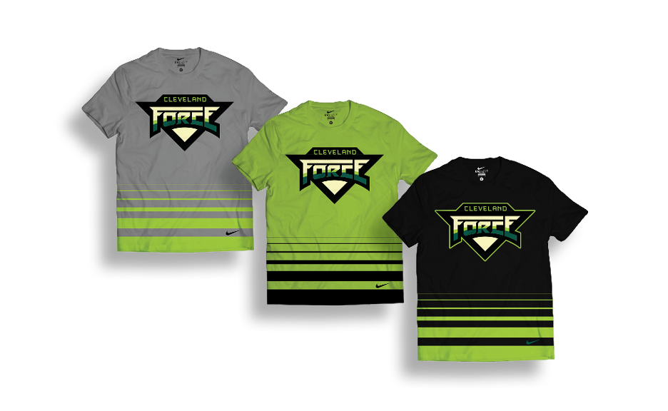
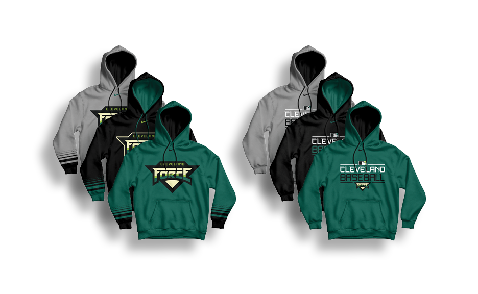
Fan gear creates an avenue for the people of Cleveland to embrace the team and become part of the team. The gradient on the players' jerseys and on these fan artifacts was implemented to symbolize the six American League pennants of the franchise. It is important to discard all offensive aspects of the existing brand, but the achievements of the city's franchise are a source of pride and should never be forgotten.
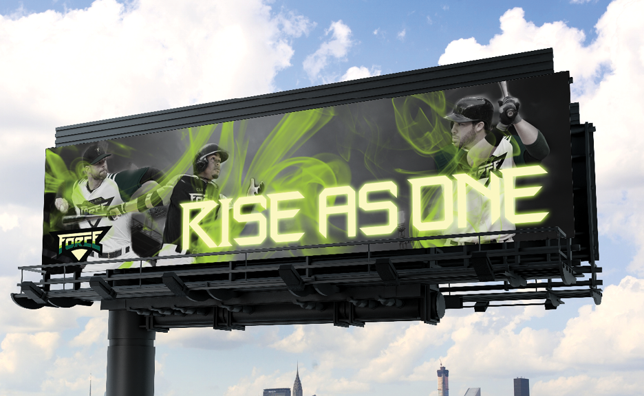
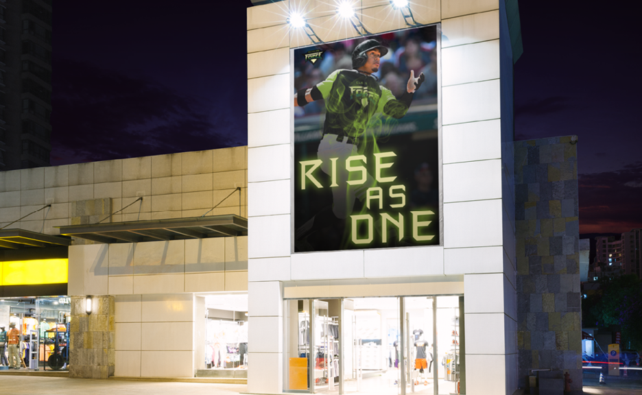
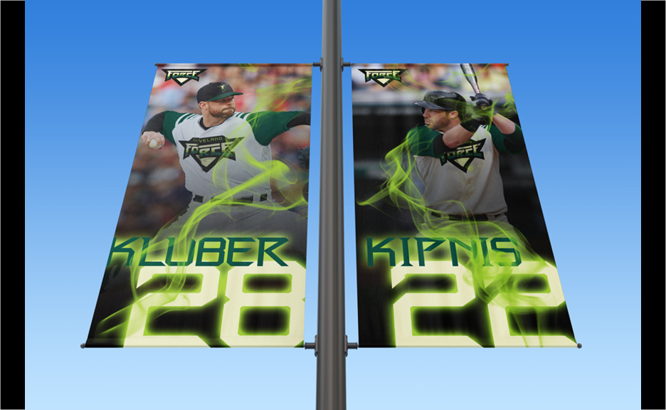
The flexibility of the brand and it's elements means that signage can be placed in all forms across the city to create a unified force behind the new team. The wispy green smoke within the brand was developed to signify the smoke from the fire on the Cuyahoga River in 1969, a tragic event that reminds the city of the harsh circumstances they have overcome through grit and hard work.
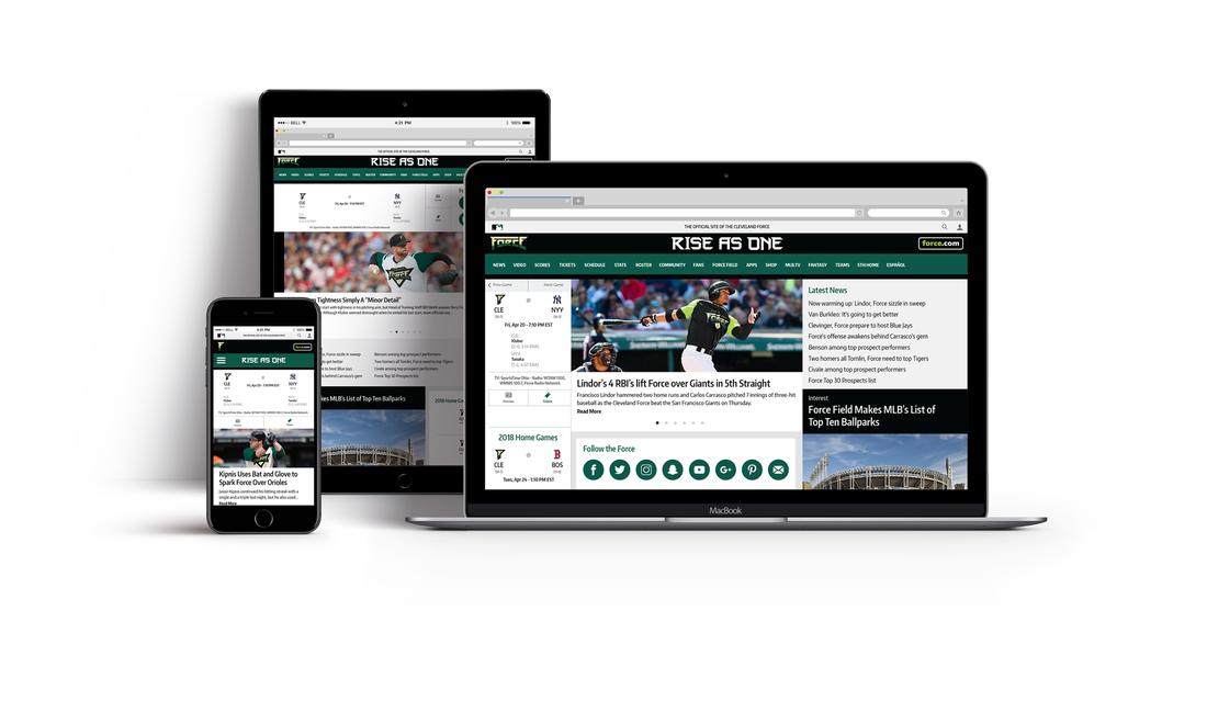
An online presence was created continue a coherent brand. This web layout shows a unique aspect of the brand while still adhering to the web layout guidelines and system of the MLB.
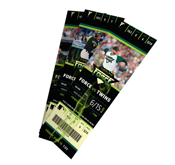
Even down to the small details of the team's home tickets, the Cleveland Force brand creates excitement in the minds of the fans as they prepare for an unforgettable experience at the Cleveland Force ballpark.
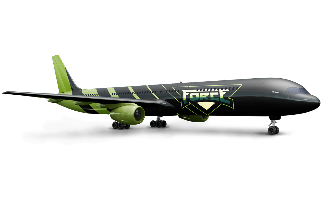
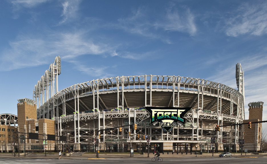
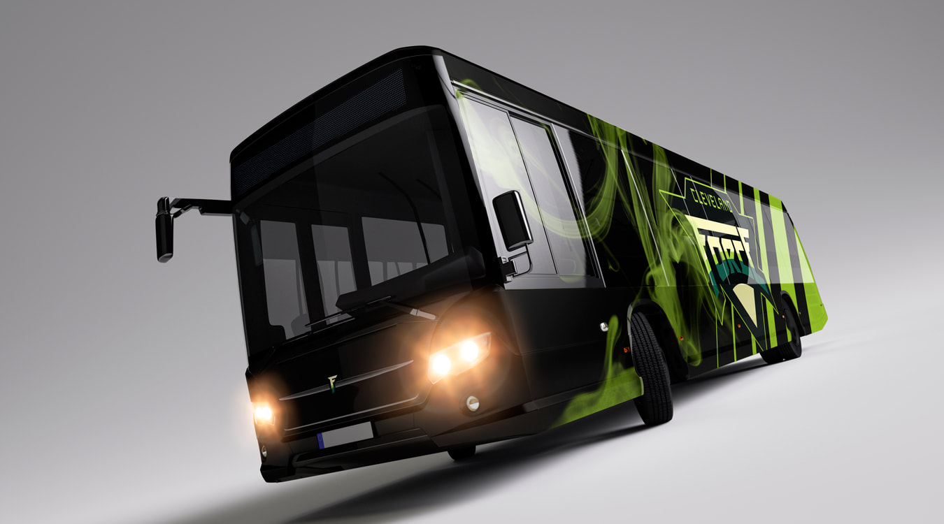
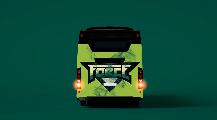
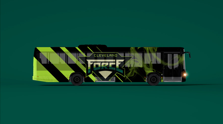
The presence of the team as it arrives through the air or by land is also something that the city of Cleveland should be proud of. These vehicles provide the backdrop for a team entering the park, poised to be a Force in any contest.

I believe that this project reaches beyond logo and brand identity development. It uses all the tools of design to reach into the hearts of people to begin rectify decades of insensitivity and disrespect towards First Nations people. If you'd like to learn more about the issue or any part of this project, I'd love to hear from you!